Tuesday, September 20, 2011

Out of Class Research

Commercial:

This commercial seemed completely genuine to me.  There were two things I really noticed that made me believe it was solely heartfelt.  First, when the children were singing, a couple of the firefighters were tearing up and all the rest looked touched that the children were there recognizing them for all they'd done.  Also, after watching the commercial, I was struck by the words that flashed upon the screen at the end of the commercial.  Never Forgotten.  Always Thankful.  Those words give the viewer a lasting feeling of respect and gratefulness for the firefighters.  They're just simple black words on a white background, but they're so meaningful and real that you won't forget them.  

Behind the Scenes:

Watching the Behind the Scenes only confirmed my beliefs that the commercial was completely genuine.  I found myself tearing up when the firefighters talked about the men they lost.  When the director talked about his own experiences that day, I remembered once again where I was when I heard about the planes striking the towers.  I loved that they brought all those children in to sing and create a genuinely beautiful tribute commercial.  It was wonderful to watch.

Miller Gallery:


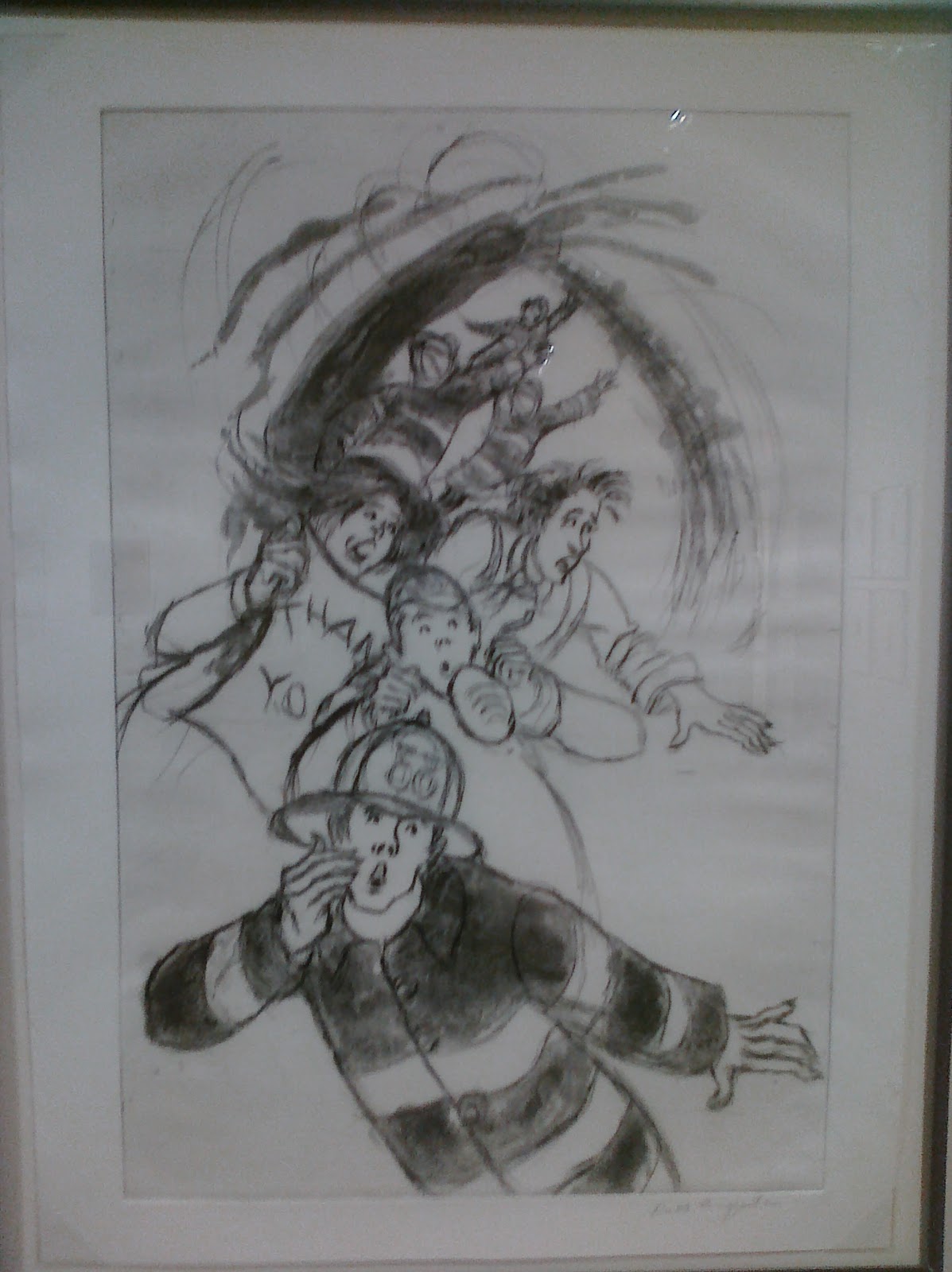
 This piece really caught my attention because you can see the worry, gratefulness, and aid all in one picture.  Those are three of the most all-consuming things from 9/11.  I love how the firefighter is right there calling for help while people rush about and try to get away from the flames.  I also love the one woman holding the 'Thank You' sign.  It reminds me how, even with everything going on at the same time, everyone was so thankful for the firefighters and heroes who were there to help when the towers were in flames.  This one piece of artwork depicts everything I remember from 9/11.


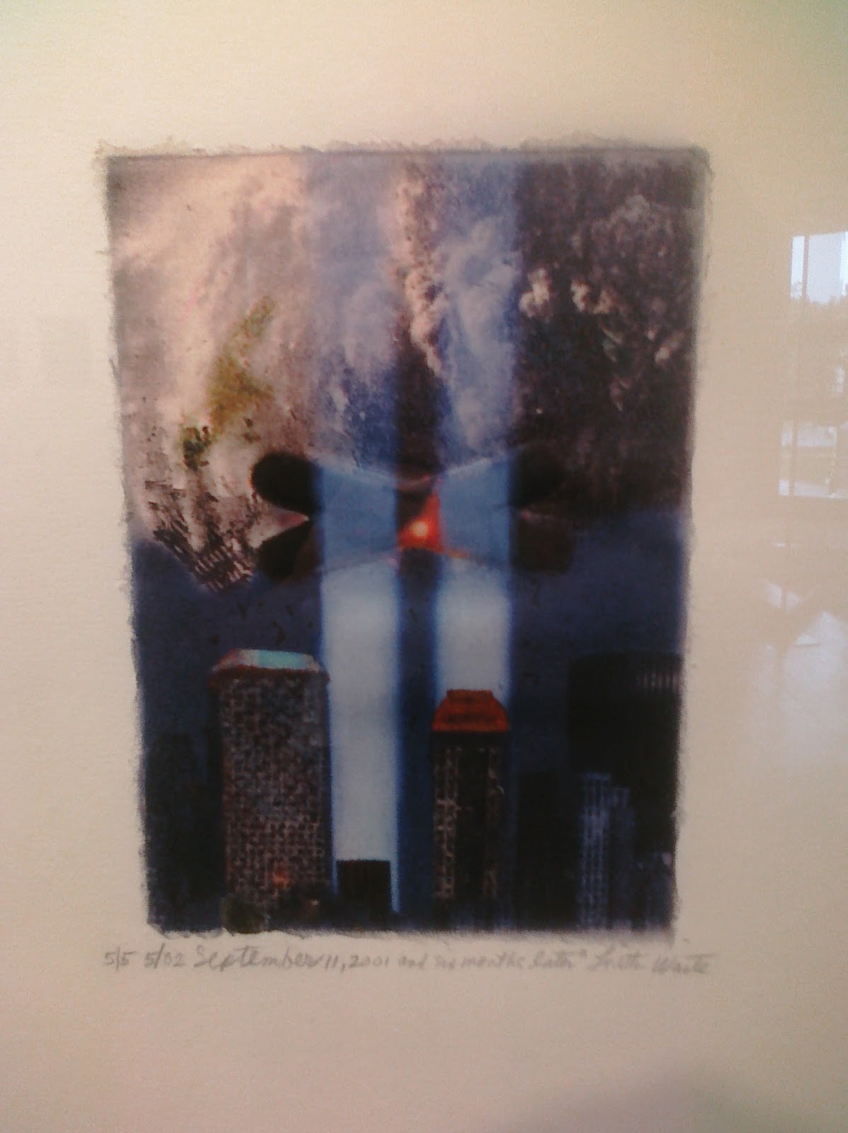
 My attention was also caught by this piece of artwork.  I love how it's such a strong sense of  remembrance.  You can see where the towers were, as well as the city as it is now and the destruction as it was then.  It's such a powerful combination because you can see the old and the new all in one with how it came to be that way.  I remember when the beams of light were there in all the tributes.  This piece is powerful because it makes you remember everything about the city and the tragedy. 

After spending time in the gallery, I just remember how powerful it was to see all the tributes to 9/11.  There were many pieces I didn't understand at first, which almost made them even more powerful once I finally did understand what they were trying to show me.  I was so young when everything happened, only 10 years old.  I didn't really understand everything that was going on, so it's even more striking now because I can understand everything when I see it.  The gallery itself was quiet, so it made looking at all the artwork so real and gave the viewers a chance to really take it all in.

Monday, September 19, 2011

Homogenized Culture

Homogenized - to make uniform or similar, as in composition or function.

I'm not so sure I believe homogenization of a culture is possible.  Yes, you can target an audience by making generalizations towards the majority of a class.  We saw evidence of this in the Toyota commercials we watched in class.  We agreed that the main character of the commercials was someone we've all met in real life.  However.  That girl who worried about her parents not having a life because they didn't have many friends on Facebook and who did nothing but sit around on the computer or watching TV is just a generalization of Generation Y.  Certainly some people do behave just like this, I know a few for sure, but the entire culture does not act this way.  It's impossible to homogenize a complete culture.  Within this class alone we have people of different backgrounds who have different behaviors, interests, majors, and tastes.  It's impossible to lump everyone into one common list of characteristics.

[Mass Culture]... it thus destroys all values, since value judgements imply discrimination.  Mass Culture is very, very democratic:  it absolutely refuses to discriminate against, or between, anything or anybody.

When reading this statement, I found myself getting confused.  The first statement implies that Mass Culture destroys values and makes everything the same.  The second statement, however, says Mass Culture is democratic, which by definition would mean all cultures and values are represented.  The second statement then goes on to repeat that Mass Culture doesn't discriminate against or between anything.  That's a contradiction.  After reading Chapters 2 and 3, I'd have to agree with the portion of the statement that says Mass Culture makes everything the same.  It's a generalization of the majority of a culture.  Think about the advertising for an election.  The majority of the United States is Middle Class, so the advertisements and speeches are primarily about what the candidate will do for the Middle Class.  If you're watching a JCPenny commercial, you'll see colorful shirts and skinny jeans.  This is what most people are wearing today, so that's what they want to advertise.  You won't see the baggy black pants with the chains or the hippie-esque shirts that you'll see some people wearing.  The minority of people wear that type of clothes, so advertising that wouldn't get them the sales they're looking for.  The minority is lost in Mass Culture.  They're appealing to the masses, not the individuals who stand apart from the masses.

Monday, September 12, 2011

Elements and Principles of Art

Line

This Challenge Accepted meme uses line in a powerful way.  The character is entirely made up of strong lines, which give off a feeling of confidence or stubbornness.  The whole idea of this meme is to take things people always say aren't possible and stubbornly say it IS possible and I'm going to do it.  Just by looking at the lines that make up this character (the bold smirk, bold crossed arms, bold half-closed and not-worried eyes), you can get that feeling of stubbornness and you know that the character will go to great lengths to win the so called challenge.

Texture


This painting uses texture to give the effect that you're looking through a waterfall.  The wavy appearance looks like water, but you can still tell there is a pond and a leafy scenery behind it.  I absolutely loved this painting as soon as I found it because the texture gives such a cool feeling to the painting.  I haven't seen anything like it before.  The texture makes the viewer feel relaxed.

Color


Andy Warhol is known for his use of colors in his prints, so it only makes sense that I would choose one of his to demonstrate color.   Warhol has a series of this same flower print, all using a different color scheme.  This one uses earthy blues and greens, but there are others that use fiery reds and oranges or calm pastel yellows and blues.  Warhol relies color to give each print a different feel. 
Emphasis


This painting uses emphasis to put your focus on the center of this painting.  The center of the flower is a bright blue that catches your eye every time.  From there, your eyes naturally follow the petals to the ends because the artist started with a blue center and then made it gradually more pink as your eyes travel outward.  Finally, the canvas all around the flower is black, which emphasizes the flower even more.  There's even emphasis working to make you notice one flower and then the other separately.  The top one has a slightly lighter color scheme, using white on the petal's edges.  The bottom one doesn't have that buffer of white before the black background.  All these uses of emphasis make the painting beautiful and memorable.

Rhythm


This painting has amazing rhythm.  The black and white portion starts out calm, then gets crazy and jumbled, and then calms out again before flowing into the pink section.  The pink section uses different shades of pink to create flowing lines from one side to the other.  These lines are smooth and mostly straight, but they also have some wave to them.  In it's entirety, the painting has a musical feeling to it.  If you start on the left and work your way across following the lines, you have a calm, yet strong, beginning then more starts happening in the piece.  The interwoven lines could be an almost Christina Aguilera worthy riff with notes all over the place until it calms down again in a long held out note at last.  The rest of the piece would is just calm with rises and falls.  The rhythm of this piece makes it what it is.

Balance


This piece has an incredible use of balance.  Every theme that is on the one side is repeated on the other side in some way.  There is a center balance that starts with the two gray blocks with a pink and red border.  From there, the artist added a large tree shape to each block.  The artist also added a jagged shape to each side, some flowing ribbon like lines across both sides, and additional shapes to finish the painting.  Each side is in total balance with the other side.

Friday, September 2, 2011

Valuable Art

 Journey - David Trotta
To me, this painting is a valuable piece of art.  To anyone else, this painting may not be seen as valuable because all it is is a 16x20 canvas with some paint slapped on it by an undiscovered artist.  It's extremely valuable to me because my best friend made it for me when I began my "Journey" to college.  I am two years older than he is, so I was the first of his friends to go away to college.  After talking to him for a while about it, he was inspired to make this beautiful painting.  The story behind the painting, as well as the fact it was made for me by my best friend, make it not only a valuable piece of art but also the most valuable piece of art I own.