Theirry is by no definition an artist. He carries around a camera to document everything in his life, but then he never intends to do anything with the footage. He claims he is making a documentary on street artists, but he never really considers doing it until Banksy puts pressure on him to do so. Even then, it's a mess of images and sounds; nothing truly watchable. He is just as much an artist as a high school student with a camera at prom. The only difference here being the high school student will dwell on the pictures for a while and upload them on to at least five different social media websites, whereas Theirry will just shove the cassette in a box without so much as a label saying what's on the tape. Theirry as Mr. Brainwash is edging closer to being an artist, but he still misses the point by a long shot. He has ideas that are creative, but his ideas are all comprised of other artists' artwork with something small added to it. Additionally, he never actually creates his own work. He hired a bunch of workers so that he could tell them what they wanted and they could make it happen. I have to give him credit, though. He is definitely passionate. He spends his days going through books looking for ideas and makes sure they all get done. Not even a broken leg could stop him from telling others what to do for his show. The real MBW is the workers he has creating his work. They are altering the images and printing them in mass quantities. The artists going through the motions are the real MBW. MBW takes images like Warhol's Monroe, "American Gothic," Elvis with his guitar, etc. and distorts them into something different yet recognizable. One of the most common things was the Monroe image but with many different people's faces. This is something he saw Banksy do, but he took it another step further. Basically all of his "work" was like this. He saw someone else do it, so he took it a step further and made it common. Another piece he "created" was a large spray can made to look like the Campbell's soup can. Again, just copying something he's seen done, but with a slight twist. My favorite part of this entire documentary was when people would call Theirry asking for prices. He literally made them up off the top of his head starting around $20,000. He's never had real experience in any of what was going on around him, so he literally faked it until he made it. He's now making album covers for Madonna, and yet he came out of nowhere with no actual experience, even as a street artist like he was claiming to be.
Banksy was shocked, to say the least. He told Theirry to go have his own gallery exhibit basically to just get him out of his hair so Banksy could get a look at the tapes and try to make an actual documentary out of it. Banksy was not at all impressed with what Theirry took six months to put together - a mess of images that only looked sketchy. Banksy talked about how he thought Theirry was a little crazy. Theirry (with his minions) put together a show in about six months that was at least three times the size of Banksy's show, an actual street artist. It was all completely meaningless, and yet it still had people flocking to the opening to get an original print. Theirry made millions of dollars while that show was open. Banksy couldn't believe it.
Banksy's opinion of Warhol wasn't very high, as well. He owed a lot of his acceptance in the art world to Warhol, but he didn't consider him to be the artist people made him out to be. Banksy didn't believe Warhol's work is valuable. I do, however, believe Warhol to be an artist. He basically created pop culture. He was one of the first to take well-known images and distort them to be meaningless. Street artists, and people like Theirry, still copy him and his technique to this day. That is impressive. Everyone knows the name and the face when his work is mentioned. He did all his work on his own, using prints. Growing up in Pittsburgh right near the Warhol museum gives me respect for his work, but living among it makes me enjoy it. He paved the way for many artists after him, which makes him unique.
Monday, December 12, 2011
Monday, November 28, 2011
Wasteland
In the movie Wasteland, Vik and his wife disagreed about whether or not it was good to take the people out of the landfill for a short time. Vik believed it would be good for them to get out and see what else the world has to offer. He thought this experience would inspire them to find something better to do with their lives. The people he met while he was at the landfill didn't know what the rest of the world was like. They only knew what happened in their own lives day to day. Vik's hopes were to get them to better their lives by realizing what other cultures are like.
Vik's wife, however, disagreed. She thought that Vik's plans to take them out of the landfill for a time would only make them more miserable when it was time to go back to their real lives. She didn't think this project would do anything but harm to these people. When Vik first interviewed the people, they were happy. They were proud of their work there because it meant they weren't selling their bodies or drugs. Vik's wife feared that they would lose this happiness and pride when they realized what else the world has to offer and not be able to make a change.
I agree with Vik in this situation. By having them make their own artworks, he was showing them that they have more options in life than being a garbage picker. He gave them the means to make something happen in their lives. They were so proud of their pictures and put them on display in their homes to look at all the time. When they were interviewed at the museum, they all mentioned about how proud they were to turn the garbage and recycling they work with on a daily basis into art. They are all intelligent, creative individuals, and Vik's project helped them realize it. In the end credits, it showed where the people featured in the story ended up, and many of them made something happen in their lives. One lady left her husband like she'd wanted to do for a while. One lady tried something else and missed the landfill and went back. This project helped them make a decision about where they wanted to be in their lives, instead of taking working in the landfill as their only option.
Monday, November 14, 2011
Ambient Advertisements

I feel this is an extremely strong example of an ambient ad. When you're heading to your car, you only see the white back of the poster, therefore it's a shock when you get inside and see what the poster is actually about. It's a shocking image that I still find hard to look at, even after I've studied it for a while. To me, this would make it effective. I would definitely slow down when driving around schools, because I would never want to see that image in real life. It's a strong example of an ambient ad because it would cause a change. No one wants to hit a child, and this advertisement is a not-so-gentle reminder of the risks a person takes when speeding in a school zone. The speed limit is low there for a reason. The format itself that they use is strong because the background looks exactly like a cracked windshield and the image looks so real it's scary. The calm, white, block script saying, "Please don't speed near schools" is easy to read and also catches your attention because of how much it stands out against the girl's yellow sweater. There is only one possible drawback to this advertisement that I can think of. It's very possible that it's much too shocking. It works for me because I do drive and I wouldn't want to see that image come to life on my windshield. It wouldn't be good, say, for the 4 year old daughter of the driver of the car. This image would be way too shocking for a child, which could cause major upset for the poor little kid.

This is another strong example of an ambient advertisement. It would catch my attention no matter where on the street I was. If I were walking underneath the ad, I would be surprised when it lit up and therefore notice it. If I were driving or standing on the other side of the street, I would enjoy watching as other people walked under it and made the light bulb light up. It's a strong advertisement because it's out of the norm and it would catch the attention of any passers-by, no matter where they happened to be standing. It's general simplicity helps as well. The plain red background featuring the light bulb and the words, "The Economist," calls attention to itself by making it easy to understand. It's easy to see that Abbott Mead Vickers BBDO were trying to make an advertisement that led the viewer to think readers of The Economist are intelligent people. Even if the viewer didn't know what The Economist was, they would remember the advertisement and be able to look it up once they got home. They would see the same red simplicity and connect the two forever. The format, therefore, is spectacular. It grabs the viewer's attention in every way. One possible drawback could be that it doesn't specifically say anything about it being a magazine. Someone might walk by and see the sign but not do anything about it because they're unsure of what The Economist is. They're banking on the person having time at the end of the day to do a little research into it.
Friday, October 28, 2011
The Power of Words/Ideas
Just Do It
Nike's famous Just Do It campaign came from the execution of Gary Gilmore. His last words were Let's do it. Wieden and Kennedy found inspiration from this and created the entire Just Do It campaign, which made Nike one of the most well-known companies around. I can remember how big this campaign slogan was when I was in elementary and middle school. We would always walk around daring each other to do things and saying, "Just do it, just do it!" It became an everyday term for people who came into contact with these advertisements. Since the late 80s when this campaign started, shirts and posters and anything else you can think of have been made using this slogan for something else. My favorite is a shirt my friend has that says, "Oh, that? Just did it."
Got Milk?
Got Milk? is another extremely well-known campaign. Goodby Silverstein & Partners came up with this after a long struggle. They had the image, but couldn't decide on a slogan. Someone suggested this and everyone fought it because it's only two words - not even a sentence. Finally, people realized how perfect this short slogan is, and the campaign took off in the early 90s. This slogan gained more attention for milk sales and they raised almost immediately. Everywhere you look, let it be a school cafeteria, TV, or a magazine, you will see a Got Milk? ad. There are some that feature historical events, celebrities, cows, etc. but they all feature those words in large print somewhere on the advertisement. Since the creation of this slogan, there has been an explosion of Got _______? merchandise. When I went to Switzerland, I bought a shirt that says, "Forget milk. Got beer?" This campaign tagline is literally everywhere you look in today's society, even if it's not advertising milk.
Friday, October 14, 2011
Advertising Agency
Name
Abbott Mead Vickers
History
David Abbott, Peter Mead and Adrian Vickers founded AMV a little over 30 years ago. They wished to become the best agency in the UK. They stuck with that goal and have been the biggest UK agency for the past 14 years. They work with around 85 companies and use digital, experiential, print or broadcast media on a case-by-case basis. AMV is a part of the BBDO network.
Mission
Help solve their business challenge with creative ideas that change the competitive landscape.
Location
London, England UK
A. They're on a soccer field in the UK. There is nothing that specifically says a certain time, but it was made in 2007.
B. The subjects are people who play soccer and people who watch it from home in the UK.
C. The recliners play a large part in this advertisement. It's what makes the commercial funny and effective. You see them struggling to play, so you want to get in there yourself.
D. AMV joined with UEFA to get fathers and sons all across Europe into the game. The whole campaign is called the "Get Active Campaign." This campaign needed to speak to people in many different cultures, so they chose something everyone could relate to: soccer (or as they call it, football).
E. The ad was made in 2007.
F. The relationship between myself and this ad is I'm one of the people who watches the game from the comfort of her own home. I used to play sports, but I've since given that up. I can definitely relate to the message of getting active that they're trying to send.
G. The target audience is fathers and sons everywhere in Europe. The cultural assumptions made in this ad are that everyone appreciates soccer. Most, if not all, of the countries in Europe have soccer teams, so they're using that knowledge to be able to touch everyone with their message.
H. No. Everything about the ad speaks to fathers and sons. They're playing sports together, so it shows bonding and becoming active together.
I. All the people in the ad are men and boys. That's who their target audience is. They're showing men and boys playing the game together.
J. This ad shows a bunch of people struggling to play soccer in their recliners and at the end it says, "Go on get out of your armchair." It fits right together because both make you want to get up and join the fun.
K. The advertisement is trying to promote an active lifestyle. The company, UEFA, wants everyone to get up and involved in sports.
L. I chose this ad because the whole premise cracked me up. It's too true! There are always going to be those that play and those that scream at the TV from their recliners. While I'm not about to get up and play some sports because I don't have that interest anymore, I would definitely try to put a recliner soccer game together.
Wednesday, October 5, 2011
Gender in Advertising

I chose this image to demonstrate gender roles in advertising because it portrays both women and men in one advertisement. The both models are dressed well and are looking sexy for the viewer. This is so typical for advertisements today. If a company wants to sell something to consumers, they make it look like you'll be drop dead gorgeous if you wear the jeans, perfume, deodorant, sunglasses, etc. they are selling. Second, the man is in control of the woman in this image. His hand is controlling where she looks with a powerful, violent hold which shows male dominance.
Tuesday, September 20, 2011
Out of Class Research
Commercial:
This commercial seemed completely genuine to me. There were two things I really noticed that made me believe it was solely heartfelt. First, when the children were singing, a couple of the firefighters were tearing up and all the rest looked touched that the children were there recognizing them for all they'd done. Also, after watching the commercial, I was struck by the words that flashed upon the screen at the end of the commercial. Never Forgotten. Always Thankful. Those words give the viewer a lasting feeling of respect and gratefulness for the firefighters. They're just simple black words on a white background, but they're so meaningful and real that you won't forget them.
Behind the Scenes:
Watching the Behind the Scenes only confirmed my beliefs that the commercial was completely genuine. I found myself tearing up when the firefighters talked about the men they lost. When the director talked about his own experiences that day, I remembered once again where I was when I heard about the planes striking the towers. I loved that they brought all those children in to sing and create a genuinely beautiful tribute commercial. It was wonderful to watch.
Miller Gallery:
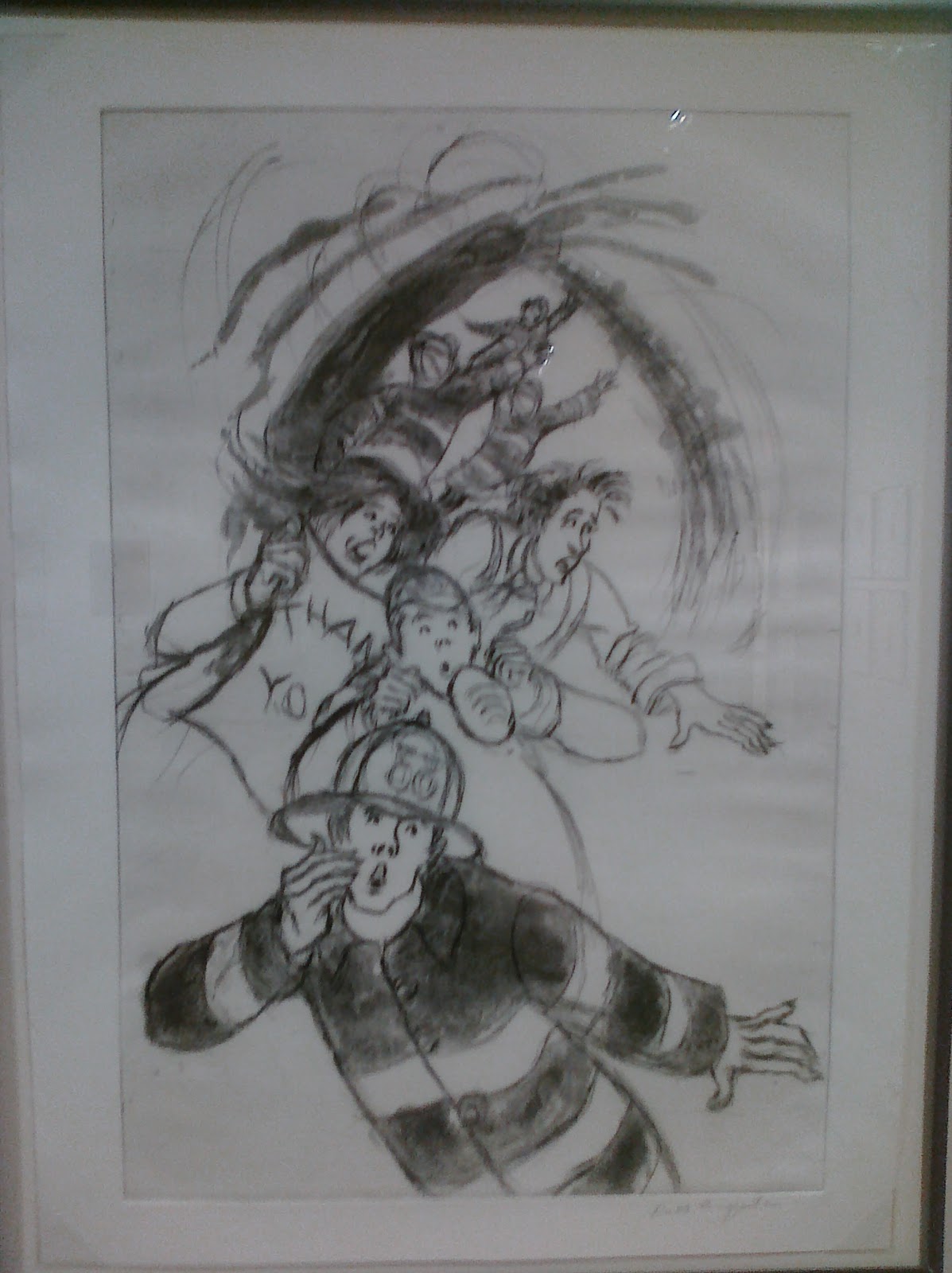
This piece really caught my attention because you can see the worry, gratefulness, and aid all in one picture. Those are three of the most all-consuming things from 9/11. I love how the firefighter is right there calling for help while people rush about and try to get away from the flames. I also love the one woman holding the 'Thank You' sign. It reminds me how, even with everything going on at the same time, everyone was so thankful for the firefighters and heroes who were there to help when the towers were in flames. This one piece of artwork depicts everything I remember from 9/11.
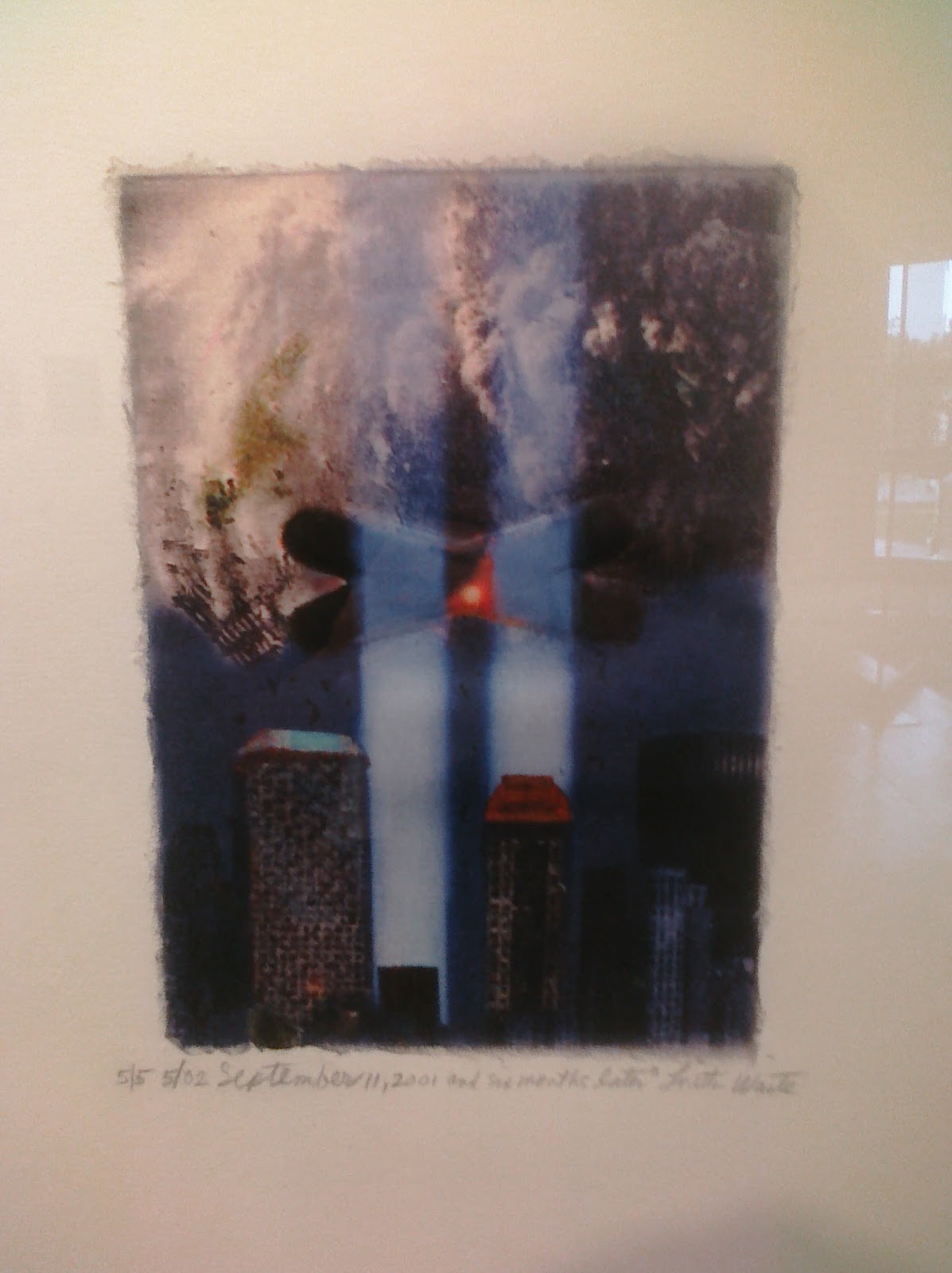
My attention was also caught by this piece of artwork. I love how it's such a strong sense of remembrance. You can see where the towers were, as well as the city as it is now and the destruction as it was then. It's such a powerful combination because you can see the old and the new all in one with how it came to be that way. I remember when the beams of light were there in all the tributes. This piece is powerful because it makes you remember everything about the city and the tragedy.
After spending time in the gallery, I just remember how powerful it was to see all the tributes to 9/11. There were many pieces I didn't understand at first, which almost made them even more powerful once I finally did understand what they were trying to show me. I was so young when everything happened, only 10 years old. I didn't really understand everything that was going on, so it's even more striking now because I can understand everything when I see it. The gallery itself was quiet, so it made looking at all the artwork so real and gave the viewers a chance to really take it all in.
Subscribe to:
Posts (Atom)